Kaytlyn Tanner
Kaytlyn Tanner

Daily Dish

A discovery-driven approach to stress-free meal prep

Meal planning and preparation can often feel overwhelming. Finding recipes that suit everyone’s tastes is a challenge, and creating a grocery list can be time-consuming. That’s why I created Daily Dish- to help ease the burden of meal planning. As a personal project, I built a prototype based on UX research to show a simple approach to the meal planning process.

my Role
UX/UI Designer
Duration
6 Weeks
Overview
Challenge
The majority of people find meal planning frustrating and time-consuming, even though they know it makes life easier. The biggest hurdle isn't the cooking—it’s the indecision.
Solution
Daily Dish was built to turn meal planning from a chore into a seamless experience. Rooted in user research, this prototype focuses on solving decision paralysis by providing meal inspiration and grocery coordination, simplifying the entire journey from figuring out what's for dinner to a finished shopping list.
Research
Survey
To gain insight into user behaviors and attitudes toward meal planning, I conducted a survey with 12 participants. The numbers revealed that "decision paralysis" is a major pain point:
75%
struggle daily with deciding what to make
83%
feel stressed when deciding what to make
58%
currently meal plan and find it difficult
Time & indecisiveness
are the most common challenges with meal planning
User Interviews
I followed up the survey with user interviews to get deeper insights. Many participants shared that meal planning "felt harder than it should be". The recurring themes weren't about a lack of cooking skills, but rather a lack of ideas, constant indecisiveness, and a struggle to find the motivation to plan ahead.
Competitive Analysis
I looked at three competitors, including Plan to Eat, to identify what worked well and where gaps existed. While they had great features (like web importing and dietary filters), they felt cramped, were difficult to navigate, or had long onboarding processes. None of them combined inspiration and ease-of-use into one seamless experience.
Analysis
Affinity Map & User Personas
To make sense of the data, I used an affinity map to group the insights into clear patterns. This led me to focus on two goals: simplifying the flow to reduce stress and save time, and providing inspiration to help users beat indecision.

I created two user personas from my research findings. Emily, a lawyer, needs variety without the time-consuming planning, while Ross, a university student, needs a foolproof way to organize his shopping and avoid wasting food.
Sitemap & User/Task Flows
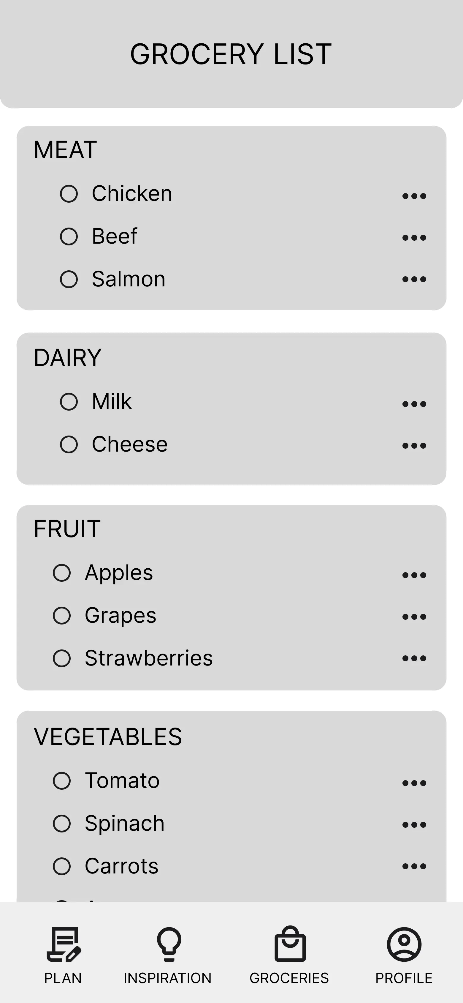
To make sure the app actually felt intuitive, I started by building a sitemap to organize the main navigation and high-level structure. From there, I developed user and task flows to visualize exactly how a user would move through key actions, like finding meal inspiration or adding a recipe to their meal plan. I used these as a guide in creating my mid-fidelity wireframes.
Designing & Refining
Usability Testing
I conducted usability testing on my wireframes and the feedback I received helped me pivot on three critical areas:
  • From Rigid to Flexible Planning: I originally had set slots for Breakfast, Lunch, and Dinner. Users felt this was restrictive, so I moved to a flexible "Add Meal" system where they only plan what they actually intend to prep.
  • Calendar View: I added a daily and weekly view to the monthly calendar so users could focus on their immediate schedule.
  • Grocery Logic: The app would take the recipes in the meal plan and add the groceries to the grocery list. I created the ability for users to add extra, non-recipe items to their grocery lists to make the tool more practical for real-life shopping.
I took the feedback I received and continued on to create high-fidelity wireframes. I conducted usability testing once again to determine their effectiveness. Testing my wireframes revealed that there were still a few areas of improvement. I made two major iterations:
  • The "One List" Solution: Initially, I had a complex two-step process to move items from a "Recipe List" to a "Grocery List." Testing showed this was confusing. I consolidated it into a single, editable grocery list.
  • Simplifying Actions: Users were "hearting" recipes thinking it added them to their plan. I replaced the heart with an ellipsis icon that gives the choice to save the recipe for later or add it to their meal plan calendar.
Final Designs
Below are the final designs of Daily Dish.
Final Thoughts
The critique of users from usability testing is essential. Implementing the feedback I was given made the app more intuitive and enhanced overall user experience. This process emphasized the importance of iterative design and user feedback in creating a seamless experience.
View More Work
2026 Kaytlyn Tanner. All rights reserved.