Kaytlyn Tanner
Kaytlyn Tanner

Before I Do

A user-centered solution for effortless wedding planning.

Planning a wedding often feels like a second job, and it’s easy to get overwhelmed by all the details. Finding inspiration and coordinating with vendors can be a massive challenge for any couple. I designed Before I Do to simplify this experience by focusing on a personalized style quiz and an easy vendor booking process. This prototype transforms an overwhelming process into a clear, intuitive path to the big day.

my Role
UX/UI Designer
Duration
6 Weeks
Link
View Project
Overview
Challenge
Planning a wedding can be exciting yet overwhelming due to the number of details that go into making the day memorable. Couples find themselves researching multiple websites and contacting numerous vendors, all while managing the other details of their wedding. This can make the planning process both time-consuming and stressful.
Solution
Before I Do is a mobile website prototype that puts vendor search and messaging in one place. It also includes a quiz to help couples find realistic ideas based on their budget.
Research  
User Interviews
To identify the main pain points, I conducted user interviews with those who had planned a wedding or were in the middle of planning a wedding. Every person I spoke with mentioned that their budget played a key role in almost every decision, from the overall theme and food to the specific decorations. Many participants expressed frustration with the difficulty of finding vendors and confirming their availability without a long, manual back-and-forth. Additionally, several users felt that setting up the reception was a major hurdle—specifically when it came to choosing decorations, arranging tables, and managing guest flow.
Competitive Analysis
Before designing, I evaluated three major industry leaders to identify what they were doing well and where they were falling short. While these platforms had strong vendor information, they felt cluttered and lacked tools to help with early decision-making. Some of the sites made it difficult to filter vendors, and others had an uninspiring design that didn't match the excitement of wedding planning.
Analysis
User Personas
Based on my research findings, I developed two personas: Emma, a budget-conscious bride who needs to track every dollar, and Hailey, new to her city, who needs a reliable way to find local vendors.
Affinity Map
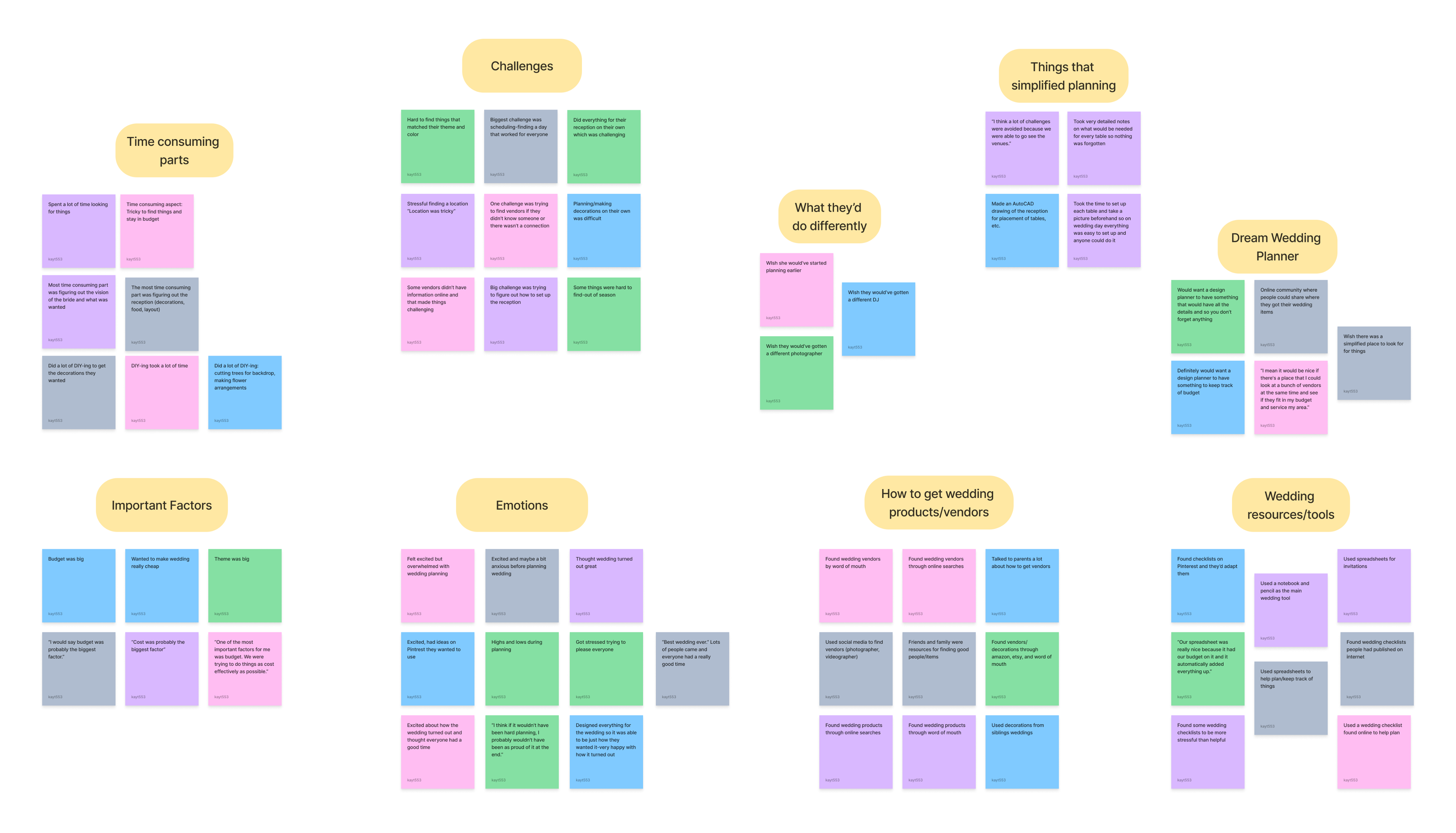
I took detailed notes on all of these observations and organized them into an affinity map. This helped me narrow down the main topics and focus on two key areas: simplifying the process of finding and booking vendors, and providing inspiration to help people craft their dream wedding on any budget.
Card Sorting
To determine the most intuitive way to organize the website, I conducted a card-sorting exercise using 36 wedding-related terms. Participants were asked to sort these terms into "Planning Tools," "Event Details," or new categories they created themselves. The results showed that many users grouped the information in similar ways, providing clear insight into how people naturally categorize different aspects of a wedding.
Sitemap & User/Task Flows
I created a site map to outline the website's structure and highlight the most important features. To ensure users could navigate the site efficiently, I focused on designing clear processes for creating an account, booking a vendor, and taking the wedding style quiz. I developed specific task flows for the booking and quiz features to create a seamless, intuitive experience that is easy for anyone to understand.
Designing & Refining
Mid-Fidelity Wireframes
With my site map and task flows in place, I moved into designing mid-fidelity wireframes. This allowed me to focus purely on navigation and functionality without the distraction of colors or images, ensuring a solid foundation before moving into high-fidelity design.
Final Designs
Usability Testing
I created high-fidelity wireframes and conducted usability testing with five participants to evaluate the vendor booking process and the Wedding Style Quiz. I focused on task completion time, error rates, and overall user satisfaction.

Key Findings:
  • 100% Success Rate: Every participant completed all tasks in about two minutes with zero errors.
  • Positive Feedback: Users found the interface straightforward, clear, and easy to navigate.
  • Areas for Improvement: Testing revealed slight confusion with the homepage search bar and a preference for moving the "prebook" button further down the screen.
I took the feedback from my usability tests and applied it to my wireframes to create the final prototype.
Final Thoughts
This project taught me the importance of solving complex problems through research and iteration. By interviewing users early on, I learned that simplicity is crucial in reducing the stress of wedding planning. Developing specific personas and using card sorting helped me stay focused on real needs and create a more intuitive structure. Ultimately, usability testing showed me that great design isn't just about looks—it's about listening to feedback and constantly refining the experience to make it as efficient as possible.
View More Work
2026 Kaytlyn Tanner. All rights reserved.